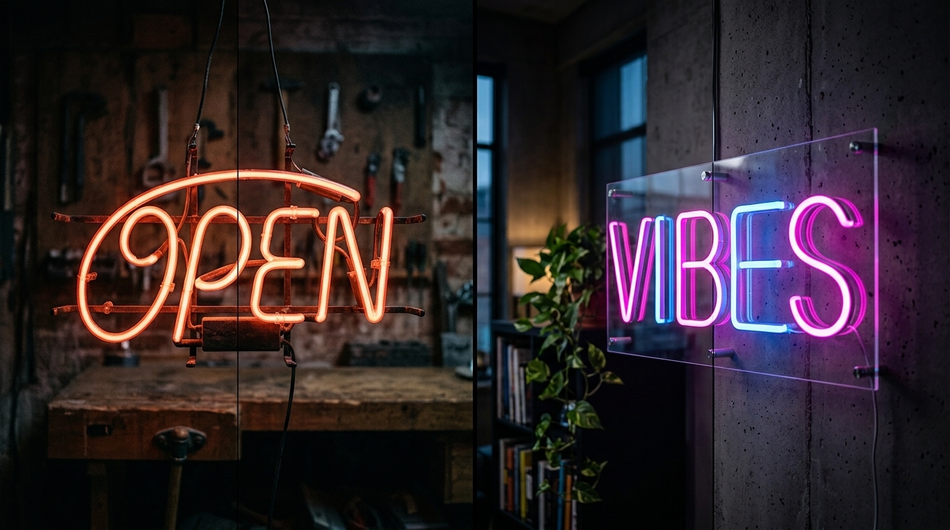
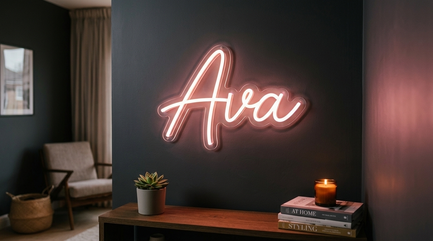
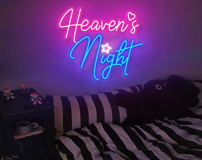
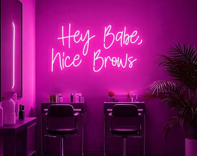
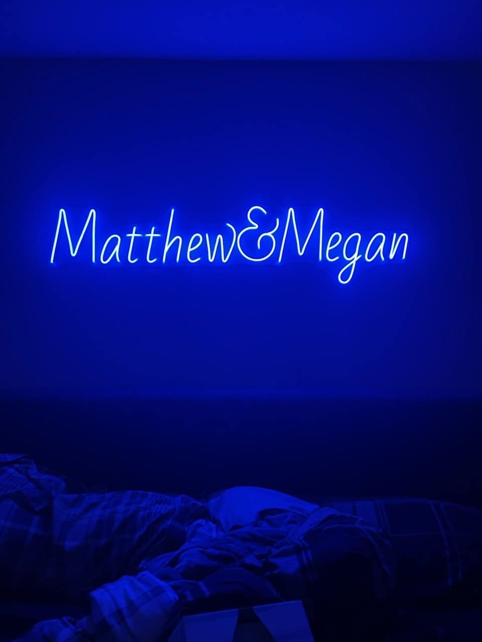
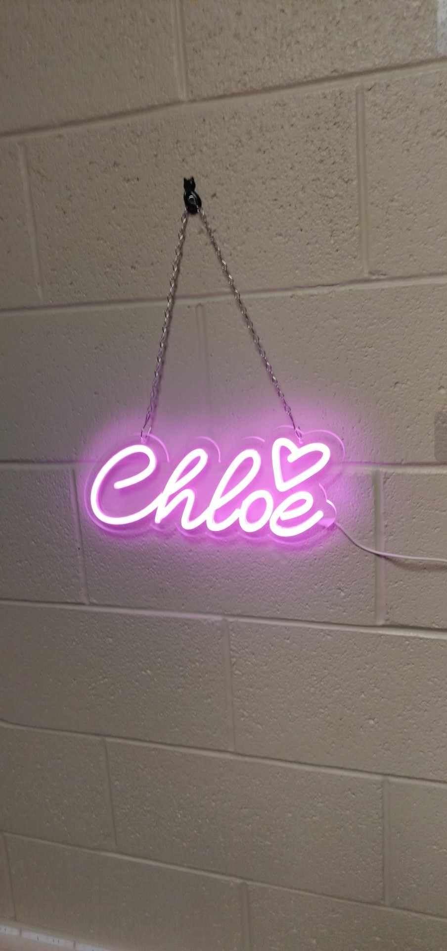
.png)
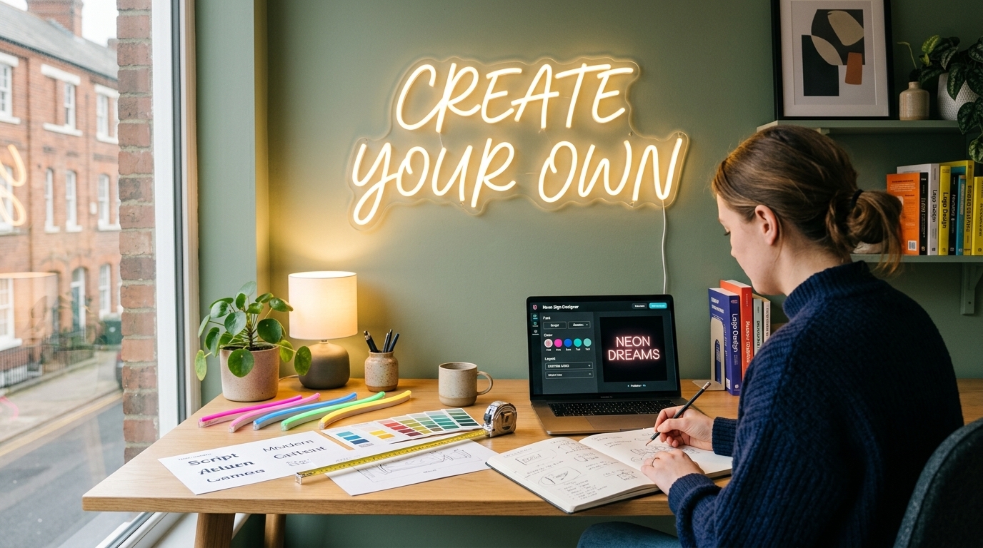
A great neon sign starts long before the lights are switched on. The words, font, colour, size, shape and placement all affect how the finished sign looks and feels. If you get those decisions right, even a simple word or symbol can become a striking piece of décor.
Whether you want a glowing quote for your bedroom, a personalised sign for a wedding, a logo for your business or a statement piece for your home, learning how to design a neon sign gives you much more control over the final result.
The good news is that you do not need to be a professional graphic designer. Modern LED neon makes it possible to create a custom neon sign design around your own idea, while an experienced neon sign maker can turn that design into a finished illuminated piece.
In this guide, you will learn how to design your own neon sign, choose the right lettering and colours, decide on the correct size, prepare your artwork and avoid common design mistakes. You will also discover when a DIY neon sign makes sense and when it is better to have your design professionally made.
What Makes a Good Neon Sign Design?
A good neon sign is more than bright tubing arranged into words. It needs to be readable, visually balanced and suitable for the space where it will be displayed.
The strongest designs usually have a clear focal point. That could be a short phrase, a name, a logo, an icon or a simple shape. When too many words, colours and decorative elements are combined, the sign can become difficult to read and lose its visual impact.
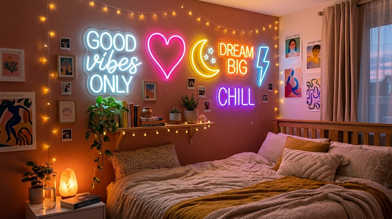
For example, compare a sign that says "Good Vibes Only" in one flowing script with a design containing several fonts, multiple colours and decorative symbols. The simpler version will usually be easier to read from across a room and will have a cleaner appearance.
LED neon is particularly useful for custom designs because it can be produced in different colours, shapes, lettering styles and sizes. This gives you plenty of freedom, but it also means you need to make thoughtful design choices.
The basic design formula is simple:
Message + font + colour + size + shape + placement = your finished neon sign.
Getting each part right is what turns an ordinary idea into a sign that looks professionally designed.
1. Start With Your Neon Sign Idea
Before opening a design tool or choosing a font, decide what you want your sign to communicate.
Ask yourself one simple question: What should someone understand or feel when they see the sign?
For home décor, your idea might be a favourite quote, family name, initials or a word that matches the room. For a bedroom, phrases such as "Dream", "Love", "Stay Wild" or a personalised name can work well because they are short and visually easy to build.
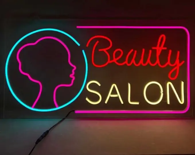
Businesses have different requirements. A restaurant may want its logo or a short slogan, while a salon might use its brand name alongside a simple symbol. A wedding could feature the couple's surname, initials or a phrase that reflects the celebration.
When creating your own design, start with the shortest version of your idea. If your original phrase contains 12 words, ask whether six or seven words could communicate the same message.
Shorter messages generally make it easier to create a clean composition and can also make the sign easier to read from a distance.
Popular Neon Sign Ideas
Your design does not have to be limited to words. Some of the most effective custom neon lights combine text with a simple visual element.
Common ideas include:
Names and initials
Inspirational quotes
Business names and logos
Hearts and stars
Flowers and botanical outlines
Arrows and lightning bolts
Food and drink symbols
Wedding names and dates
Bedroom or gaming-room phrases
Pet names
Family names
Simple line-art illustrations
The key is to choose an idea that can be translated clearly into illuminated lines.
2. Decide Where Your Neon Sign Will Go
Your location should influence your design from the beginning.
A sign intended for a small bedroom wall should not be designed in exactly the same way as a large sign for a shopfront. The available wall space, viewing distance, background and surrounding furniture all affect the final appearance.
Measure the area where you plan to install the sign. Record both the available width and height, then consider how much empty space you want around it.
For example, if you have a wall that is 180 cm wide, a 175 cm sign may technically fit, but it could look cramped. A smaller sign with generous space around it may create a much more polished appearance.
Think about viewing distance as well. A sign that looks perfect when viewed from 50 cm away may become difficult to read when seen from the other side of a room.
For bedrooms and home offices, softer and more compact designs often work well. For businesses, restaurants and event spaces, the sign may need stronger visual presence and larger lettering.
If the sign will be used outdoors, tell your neon sign maker before production. Outdoor applications can require different construction and protection from moisture compared with indoor signs.
3. Choose the Right Neon Sign Font
Font selection is one of the most important parts of LED neon sign design.
A beautiful font on a computer screen does not automatically make a good neon sign. Neon lettering needs enough space and thickness for the illuminated lines to remain clear once converted into a physical sign.
Script fonts are popular for names, weddings and decorative home signs because they create a flowing, elegant appearance. However, extremely complicated scripts can become difficult to read, particularly at smaller sizes.
Sans-serif and bold fonts are often better for business names, short statements and signs that need to be read quickly.
When you choose a neon sign font, consider three things: readability, character spacing and the overall personality of the design.
A playful rounded font can suit a children's room. An elegant script can work beautifully for a wedding. A bold geometric font may be more appropriate for a modern restaurant, gym or office.
Do not choose a font simply because it looks attractive on your screen. Type your actual message into the font and view it at the approximate size you intend to order.
This lets you spot problems with letters that sit too close together, complicated loops or characters that become difficult to distinguish.
Should You Use More Than One Font?
Usually, less is more.
Using two fonts can work when you want to create hierarchy, such as a business name in a bold font with a smaller tagline underneath. However, combining three or four fonts can make a neon sign look cluttered.
If your design needs multiple fonts, give each one a clear purpose rather than using different styles simply for decoration.
4. Select Your Neon Sign Colours
Colour dramatically changes the personality of a neon sign.
Bright pink can create a playful or energetic feeling, while blue can feel cooler and more modern. Warm white can provide a softer appearance, while green, purple, orange and red can create stronger visual impact.
Your choice should depend on both the message and the environment.
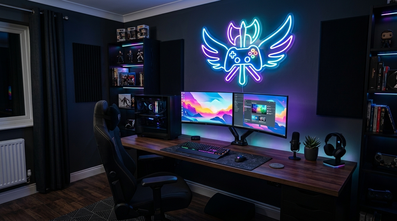
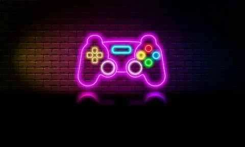
A soft warm-white sign might suit a bedroom or minimalist living room. A vivid pink sign could work well in a beauty studio or creative space. Blue or purple can complement gaming rooms and contemporary interiors.
Also consider the colour of your wall.
A bright colour against a similarly coloured wall may have less contrast and become harder to see. A strong contrast usually makes the illuminated design stand out more clearly.
Single Colour or Colour Changing?
For many designs, one carefully selected colour is enough.
A single colour creates a clean, timeless appearance and keeps attention on the message or shape. RGB or colour-changing options can be useful when you want the sign to change mood or suit different occasions.
For example, a home entertainment room might benefit from different colours, while a business logo may look more professional when it consistently uses the brand's established colour.
If you are designing a personalised neon sign as a long-term décor piece, think about whether you will still like the colour in several years rather than choosing a colour purely because it is currently trending.
5. Get the Neon Sign Size Right
Size affects both readability and visual balance.
One of the easiest mistakes is designing a sign based on how large it looks on a computer screen rather than how large it will be on the actual wall.
Before ordering, use masking tape to mark the approximate width and height of the sign on your wall. Step back and view it from different positions.
This simple exercise can reveal whether the design is too small, too large or incorrectly proportioned.
Think about the furniture underneath the sign as well. A sign above a sofa, bed or reception desk should normally relate visually to the width of the furniture rather than looking completely disconnected from it.
For example, a tiny sign above a large sofa can disappear into the wall, while an oversized sign can dominate the entire room.
Your neon sign size should therefore be based on the wall, furniture, viewing distance and purpose of the sign.
6. Think About the Shape of Your Sign
Not every neon sign needs to be rectangular.
Your sign can follow the shape of the lettering or artwork. This can create a more modern and custom appearance.
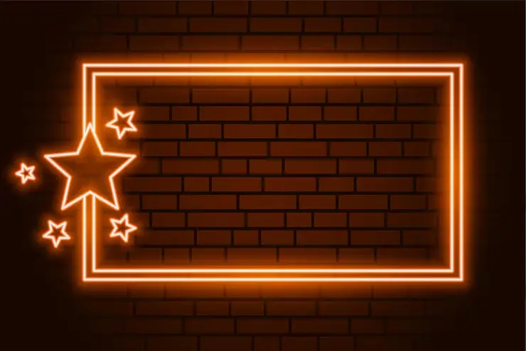
Popular neon sign shapes include circles, arches, hearts, stars, clouds, lightning bolts and custom outlines. You can also combine a word with a simple symbol.
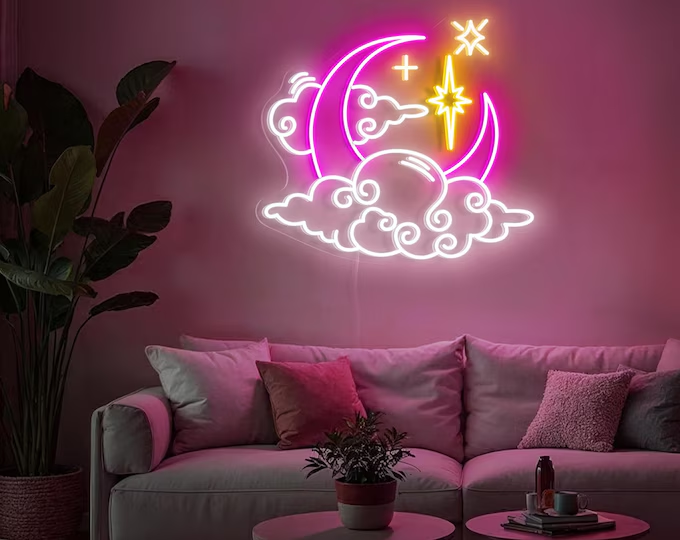
For example, a coffee shop might use its name with a small coffee cup outline. A beauty salon could combine its name with a simple flower or face outline. A bedroom sign might pair a name with a moon or star.
The shape should support the message rather than compete with it.
If the design contains a detailed illustration, simplify it wherever possible. Neon works particularly well with clean lines and recognisable silhouettes.
7. Create a Balanced Layout
A neon sign needs visual breathing room.
When designing your sign, look at the distance between letters, words and decorative elements. Crowded lettering can make the design difficult to read and may make the finished piece look heavier than expected.
If you have two lines of text, consider the relationship between them. The first line might be larger, while the second line acts as supporting text.
For example:
DREAM BIG
Every Day
The first line becomes the main visual element while the second line adds context.
You can also create balance by placing a small symbol beside or above the text rather than surrounding the entire message with decorative elements.
The goal is not to fill every available space. Empty space is part of the design.
8. Prepare Your Artwork for a Custom Neon Sign
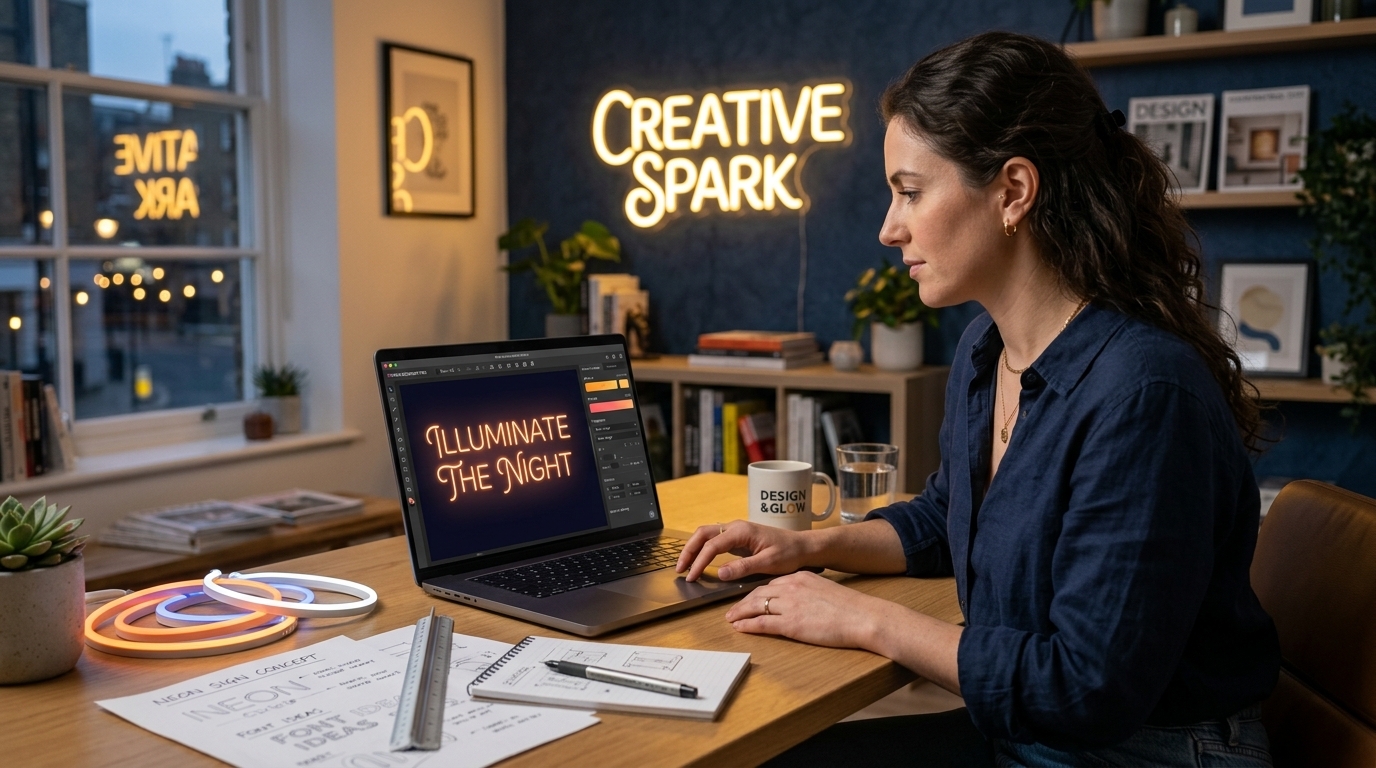
If you are creating a more complex design, you may need artwork that can be converted into a production-ready format.
Simple text can often be created through an online neon sign maker, where you enter your words and select a font, colour and size. More complicated designs such as logos, illustrations and handwritten artwork may require a custom design process.
Vector artwork is particularly useful for logos and detailed designs because it can be scaled without losing clarity.
If you already have a logo or illustration, provide the highest-quality version available. A professional neon sign maker can then assess which parts of the design can be reproduced effectively using LED neon.
Do not worry if you are not comfortable with design software. You can start with a sketch, reference image or written description and ask the manufacturer to create a digital mock-up.
A good mock-up is valuable because it allows you to see the proposed design before production.
9. Design Your Own Neon Sign Using an Online Tool
If you want a straightforward DIY neon sign design without learning professional graphic design software, an online customisation tool is often the easiest option.
The basic process is usually simple. Start by entering your wording, then experiment with different fonts, colours and dimensions. If the tool provides a background preview, use it to see how your sign might look against a wall or room setting.
Do not rush through the options.
Create several versions before deciding. For example, test the same phrase in a script font, a bold font and a minimalist font. Then compare them at the same size.
You may find that the design you initially preferred is not the strongest once you see the actual wording displayed.
Online tools are particularly useful for straightforward personalised neon signs. If you want an unusual logo, detailed illustration or complicated artwork, professional design assistance may produce a better result.
10. Understand LED Neon vs Traditional Glass Neon
If you are researching how to make a neon sign, it is important to understand that modern LED neon and traditional glass neon are different technologies.
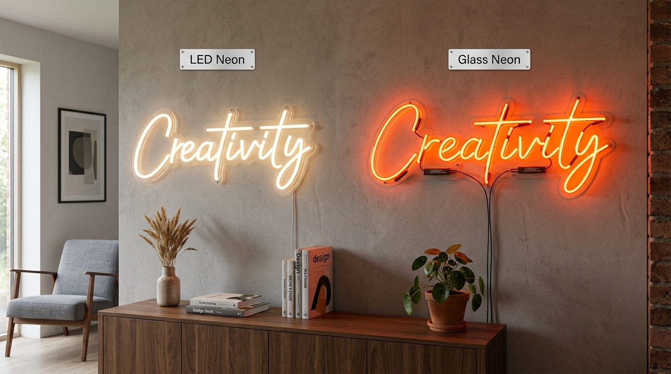
Traditional glass neon uses glass tubes containing gas, while modern LED neon commonly uses LED lighting inside flexible protective material. LED neon is widely used for custom home décor, events and commercial signage because it allows designers to create flexible shapes and detailed lettering without relying on fragile glass tubes.
For many personalised projects, LED neon is an attractive choice because it can be produced in a broad range of designs and is generally easier to handle than traditional glass neon.
The choice ultimately depends on the look, application, construction and budget you want.
For a modern bedroom sign, wedding sign, business logo or decorative wall piece, custom LED neon signs can offer considerable design flexibility.
11. Think About the Backboard and Mounting Style
The glowing lines are only one part of the finished sign.
The backing can change how the entire design looks. A clear acrylic backing can create a floating appearance, while a shaped backing can provide a more defined silhouette.
Your mounting method also affects the final presentation. Depending on the design, a sign may be wall-mounted, suspended or designed for use on a stand.
Consider how visible the mounting hardware will be and where the power cable will run.
A beautiful design can lose some of its impact if the cable is positioned awkwardly or the sign is mounted at an unsuitable height.
Plan these details before production rather than treating them as an afterthought.
12. Design for the Background
Your neon sign should work with the surface behind it.
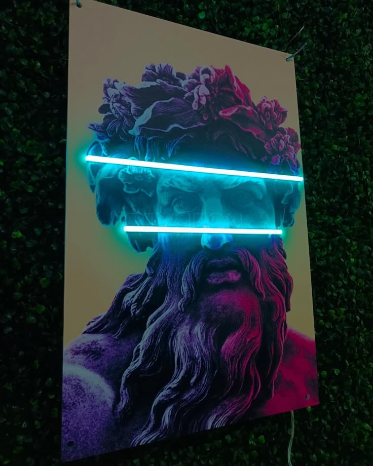
A bright sign on a plain dark wall can create strong contrast, while a pale wall may produce a softer appearance. Textured walls, brick, wood panels and wallpaper can also change the way the glow interacts with the space.
If your sign will be photographed regularly, background contrast becomes even more important.
For a business or social-media display, think about how the sign will look in photographs as well as in person. A design with clear lettering and strong contrast is more likely to remain recognisable when photographed from different angles.
13. Common Neon Sign Design Mistakes
Most design problems are easy to avoid if you think about the physical sign rather than only the digital preview.
One common mistake is choosing a font that is too complicated. Another is using too many words. Small lettering, excessive decoration and poor contrast can also reduce readability.
Another problem is choosing a size without measuring the installation area first.
Before finalising your design, check the following:
Can the wording be read easily from the intended viewing distance?
Does the font match the personality of the space?
Is there enough spacing between letters and words?
Does the colour contrast with the wall?
Is the sign large enough for its intended purpose?
Does the design have unnecessary details?
Does the shape complement the message?
Is the power supply suitable for the intended location?
Will the mounting method work on the chosen wall or surface?
Taking a few extra minutes to check these details can prevent expensive design changes later.
14. How to Create a Custom Neon Sign for Different Uses
The best design depends heavily on what the sign is being used for.
Bedroom Neon Signs
Bedroom signs often work best when they feel personal rather than commercial. Names, short quotes, initials and simple symbols can create a relaxed focal point.
Consider softer colours and fonts that complement the existing décor.
Wedding Neon Signs
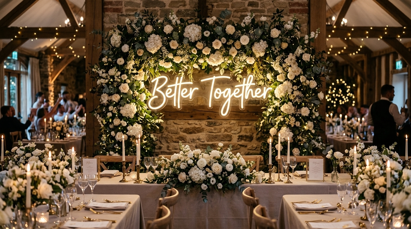
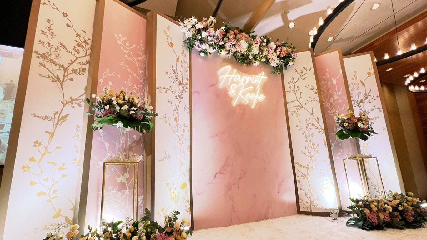
Wedding signs are usually designed around names, initials, dates or short phrases. Script lettering can create an elegant effect, while a simple symbol can make the design more distinctive.
Make sure the sign will be large enough to remain visible in photographs and from the main viewing area.
Business Neon Signs
Business signage needs to communicate quickly.
Use your actual brand font or a close match where possible. If the logo contains detailed elements, ask for a professional mock-up to determine which details will translate effectively into illuminated lines.
A business sign should be recognisable from a distance rather than simply looking attractive up close.
Home Bar and Entertainment Rooms
These spaces provide more freedom for playful designs. Short phrases, symbols, retro-inspired lettering and bold colours can work particularly well.
However, even a fun sign benefits from clear typography and a balanced layout.
15. DIY Neon Sign or Professionally Made Sign?
Designing your own neon sign and physically making one are two different things.
You can absolutely create your own concept, choose the wording, experiment with fonts and colours, and develop the overall appearance yourself. That is the creative part of the process.
Building the illuminated sign from individual LED components is more involved. It may require suitable materials, electrical components, cutting equipment, wiring and careful assembly.
For a simple decorative project, a DIY approach may be enjoyable if you have the appropriate skills and equipment. For a high-quality personalised sign, logo or commercial installation, having the finished sign professionally manufactured can provide a more consistent result.
You can still control the creative process. Start with your own idea and work with a neon sign maker to refine the design, confirm dimensions and produce a mock-up before manufacturing.
This gives you the personalisation of a DIY design process without requiring you to manufacture every component yourself.
16. A Simple Neon Sign Design Checklist
Before you approve your design, step away from it for a few minutes and look at it again with fresh eyes.
Your final design should communicate one clear idea. The wording should be readable, the font should suit the message, and the colour should work with the room or business environment.
It should also fit the physical space without appearing too cramped or too small.
A strong final check includes:
Message
Font
Letter spacing
Colour
Size
Shape
Background
Mounting position
Cable placement
Indoor or outdoor application
Final mock-up
If all of these elements work together, you are ready to move from concept to production.
How Much Does a Custom Neon Sign Cost in the UK?
There is no single price for a custom neon sign because the final cost depends on the design.
Size is one of the biggest factors. A small personalised word sign will normally require less material than a large business logo. The complexity of the lettering, number of colours, backing style, mounting method and lighting options can also affect the price.
Instead of choosing a design first and thinking about the budget afterwards, decide approximately how much you are comfortable spending.
You can then adjust the size, complexity and options to create the best design within that budget.
For UK customers, it is also sensible to confirm that the power supply provided is appropriate for UK use and to ask the manufacturer about the product's relevant safety and compliance information.
How to Get Your Neon Sign Design Right Before Ordering
The best way to reduce uncertainty is to request a visual mock-up before production.
A mock-up allows you to review the wording, font, colour, dimensions and overall layout before the sign is manufactured.
Look at the design at both close range and from a distance. If possible, compare it against a photo of the actual wall where the sign will be installed.
Ask yourself whether the sign looks balanced, whether the lettering is easy to read and whether the chosen colour works with the background.
If something feels wrong at the mock-up stage, this is the easiest time to change it.